How to Choose a React Dashboard Component Library
Choose a React dashboard component library by evaluating layouts, data display, accessibility, theming, loading states, and Next.js support.
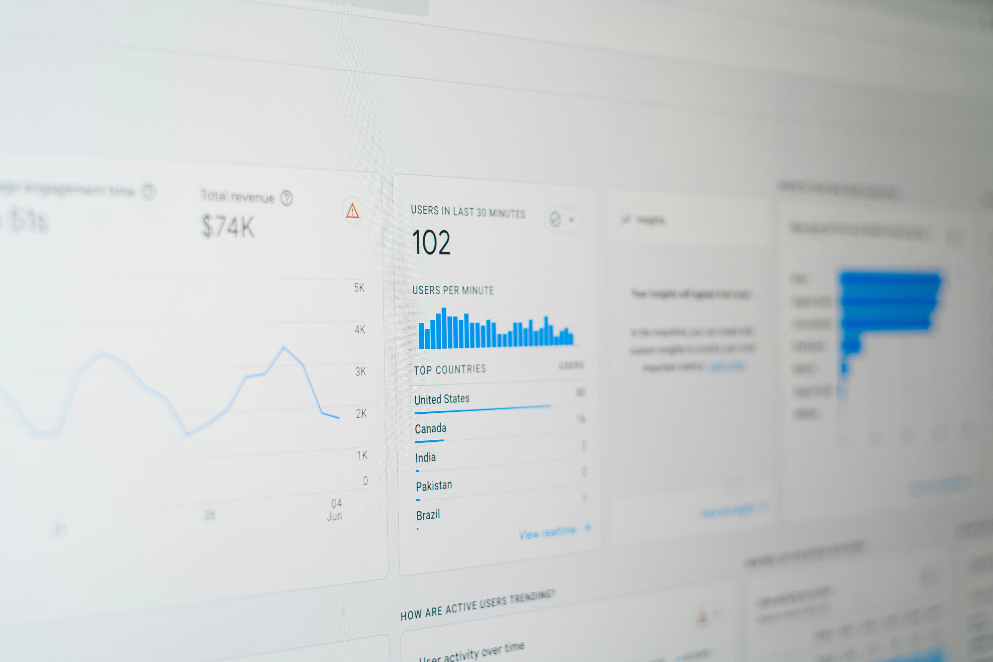
A React dashboard usually begins as a simple grid of cards. It rarely stays that way. Real products add navigation, filters, dense tables, charts, permissions, empty states, notifications, mobile layouts, and workflows that cross several screens.
That is why choosing a React dashboard component library is not only a visual decision. The right library should help a team build the complete application surface without forcing every feature into a one-off pattern.
This guide focuses on dashboard-specific buying criteria. If you are comparing libraries at a broader architectural level, start with the guide to choosing a component library for Next.js App Router.
Start with the dashboard shell
The shell determines how every screen feels. Before evaluating individual buttons or cards, check whether the library supports the regions your application needs:
- A persistent header or navbar.
- Primary navigation in a sidebar.
- A main content region with predictable width and spacing.
- Optional secondary panels or contextual asides.
- A footer or status region where appropriate.
These pieces should compose cleanly rather than relying on fixed positioning and arbitrary offsets. A reusable shell also makes it easier to preserve landmarks, skip links, focus order, and responsive behavior across routes.
Boreal UI includes an AppShell component for composing header, sidebar, aside, main, and footer regions. You can inspect a complete arrangement in the dashboard demo before deciding whether the structure fits your product.
Evaluate the complete data-display toolkit
Dashboards turn data into decisions. A useful library should cover more than decorative cards.
Look for components that support:
- Headline metrics and compact trends.
- Tables for detailed records.
- Bar, line, and donut charts for comparisons and change over time.
- Badges or chips for status.
- Progress indicators for goals and long-running work.
- Timelines for activity and event history.
The important question is whether these pieces share a visual and semantic system. If every chart, table, and metric uses different spacing and status colours, the dashboard will feel assembled rather than designed.
Boreal UI provides MetricBox, DataTable, BarChart, LineChart, DonutChart, and Sparkline components within the same theme system.
Treat filters and actions as primary workflows
A dashboard is interactive software, not a report. Users may search records, change date ranges, select segments, export data, open detail panels, or act on several rows.
Test the library with a realistic toolbar that combines a SearchInput, date control, select or segmented control, and one primary action. Check whether the controls align at common breakpoints and whether their labels remain understandable when space is tight.
Also test the states around the action. A destructive bulk operation may need a modal, a long-running export may need progress feedback, and a successful update may need a toast. A component count is less useful than a coherent workflow.
Demand useful loading, empty, and error states
Production dashboards spend a surprising amount of time between ideal states. A user may have no records yet, a filtered result may be empty, a request may fail, or a chart may still be loading.
Evaluate whether the library gives these states the same care as the populated screen:
- Use a Skeleton when the shape of incoming content is known.
- Use a Spinner for compact, indeterminate work.
- Use an EmptyState to explain what is missing and offer a relevant next step.
- Use an Alert for errors that require attention.
Avoid a dashboard that collapses or jumps dramatically as data arrives. Stable loading layouts improve perceived performance and make the interface easier to follow.
Verify accessibility in dense screens
Dashboards combine many interactive elements, so small accessibility problems multiply quickly. Test keyboard order through the full page, not only one component at a time.
Pay particular attention to:
- Visible focus across navigation, filters, charts, tables, and dialogs.
- Table headers and sortable controls that communicate their state.
- Chart labels or equivalent text that expose the underlying meaning.
- Status colours that are not the only way information is conveyed.
- Responsive layouts that preserve reading and focus order.
- Modals and drawers that manage focus predictably.
The Boreal UI accessibility report provides a useful starting point for evaluating the library's current evidence. Your own dashboard still needs testing with its real data, labels, and workflows.
Check responsive behavior with real content
Do not evaluate responsiveness using three short labels and perfect sample data. Try long customer names, large numbers, translated copy, many navigation items, and a table with the columns your product actually needs.
Decide intentionally what happens on a narrow viewport. The sidebar might move into a drawer, metrics might stack, and a dense table might scroll within a labelled region. Hiding important information should be a product decision, not an accidental CSS outcome.
Measure performance in your application
Dashboards can become client-heavy because they combine visualization, filtering, and live updates. Import only the components a route uses, keep server-renderable content outside unnecessary client boundaries, and measure a production build with representative screens.
For a deeper measurement process, use the React component-library performance guide. Package size alone cannot tell you how a dashboard will render or respond.
Run a dashboard proof of concept
Before adopting a library, build one narrow but realistic route:
- Create the application shell and responsive navigation.
- Add four metrics with one loading state.
- Add a chart with meaningful labels.
- Add a searchable, sortable table.
- Add an empty state, error state, and confirmation dialog.
- Apply your brand colours and typography.
- Test the route with a keyboard and a production build.
This exercise reveals integration cost much faster than browsing a component gallery.
Where Boreal UI fits
Boreal UI is designed for React and Next.js teams that want accessible application components, a cohesive visual baseline, and room to apply their own theme. Its dashboard-oriented layouts, navigation, metrics, charts, tables, feedback, and state components can reduce the amount of infrastructure a team must assemble before building product-specific features.
Review the component library, open the dashboard demo, and test the components against one real route. The best React dashboard component library is the one that remains coherent after real data and real workflows replace the mockup.
Enjoyed this article?